Designing Clarity at scale
A fragmented product suite with a modernization mandate. I delivered a cross-platform design system under lean resourcing constraints.
| Timeline | 2025–Present |
|---|---|
| My Role | Strategy, Product design, Design systems |
| Area | Design systems, Cross-platform UX, Design tokens |
| Tech | Figma, Design Tokens (DTCG), Node.js, .NET MAUI / XAML, Tailwind CSS, Azure DevOps |
Context
ClarityRFID’s product suite spans three very different surfaces: a web platform, handheld workflows on Android and iOS, and a Windows operational client. Those products support different users in different environments: store associates working quickly with scanners, distribution-center operators handling denser operational workflows, and managers overseeing their enterprise at a higher level.
By the time I was leading product design, the company was also pushing a broader modernization effort. We needed a shared foundation that could improve quality and reduce rework that also considered the unique needs of each context and its users.
Challenge
The product had grown across those surfaces without a shared UI foundation. Color, spacing, typography, and interaction patterns had drifted over time. Similar problems were being solved repeatedly inside individual features, and there was no dependable source of truth connecting what was defined in Figma to what shipped in code.
That showed up in two places. In the product, the suite felt less cohesive and less polished than it should have. In delivery, teams spent too much time re-solving common UI problems, aligning late on details, and cleaning up avoidable QA churn. That lack of structure became more costly as agentic development workflows emerged. Without an in-code semantic foundation, drift reproduced faster.
There was no dedicated design-system team or extra headcount to address the issue. I led the effort as the sole designer, building the foundation and delivery model in parallel with active roadmap work.
Approach
Automated foundations
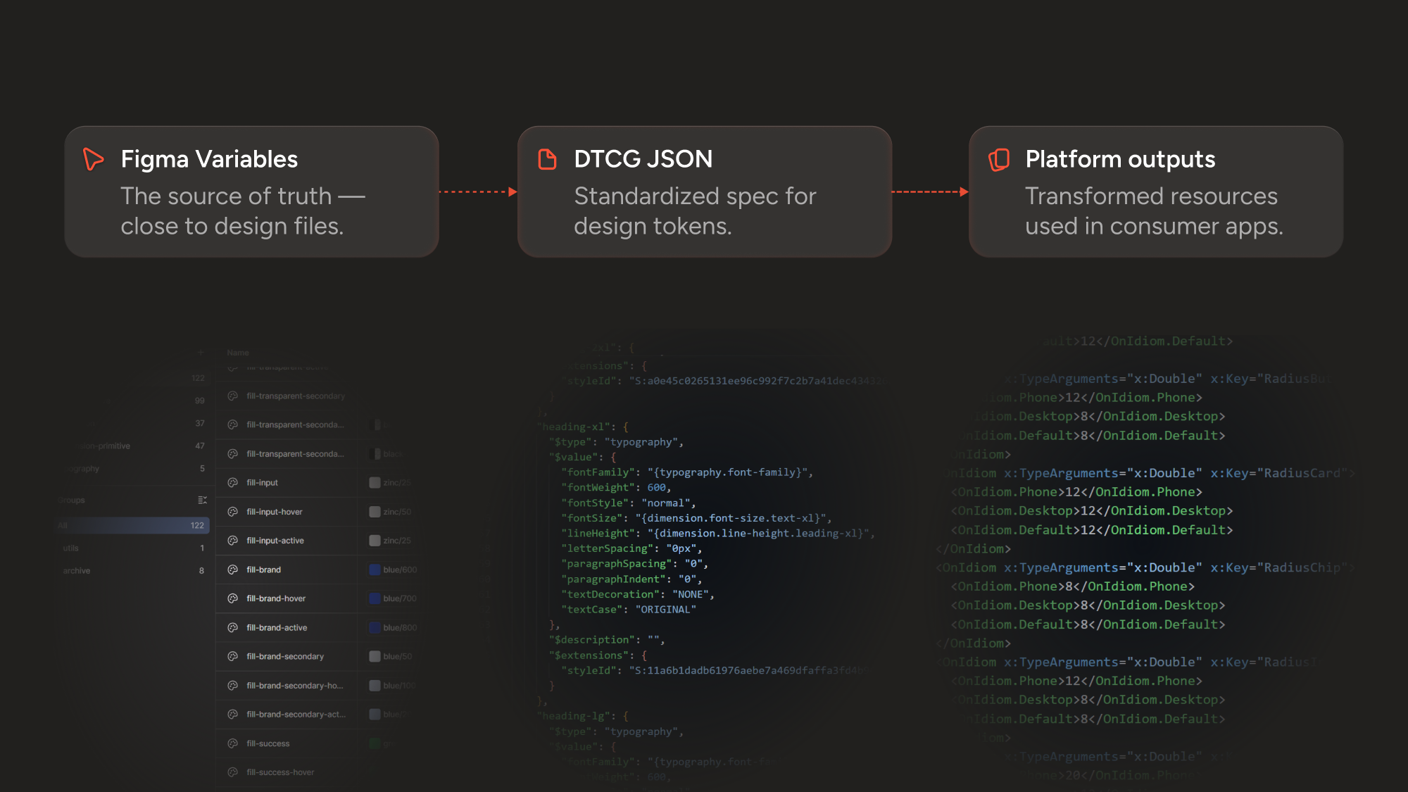
I treated the system as product infrastructure, not a side library. The highest-leverage place to start was tokens. I built a structured token system in Figma Variables with a focus on semantic meaning. That allowed us to create a shared language that could travel across platforms and support theming, and reduce rework down the road when underlying primitives changed.
From there, I stood up and automated process using Figma's REST API to export those tokens as platform-agnostic DTCG JSON, then used Terrazzo to transform them into platform-specific outputs for web and .NET MAUI/XAML. Finally, an Azure DevOps CI pipeline handled linting, accessibility checks, and package distribution so the system could scale through tooling rather than manual handoff.
Shared logic, not identical UI
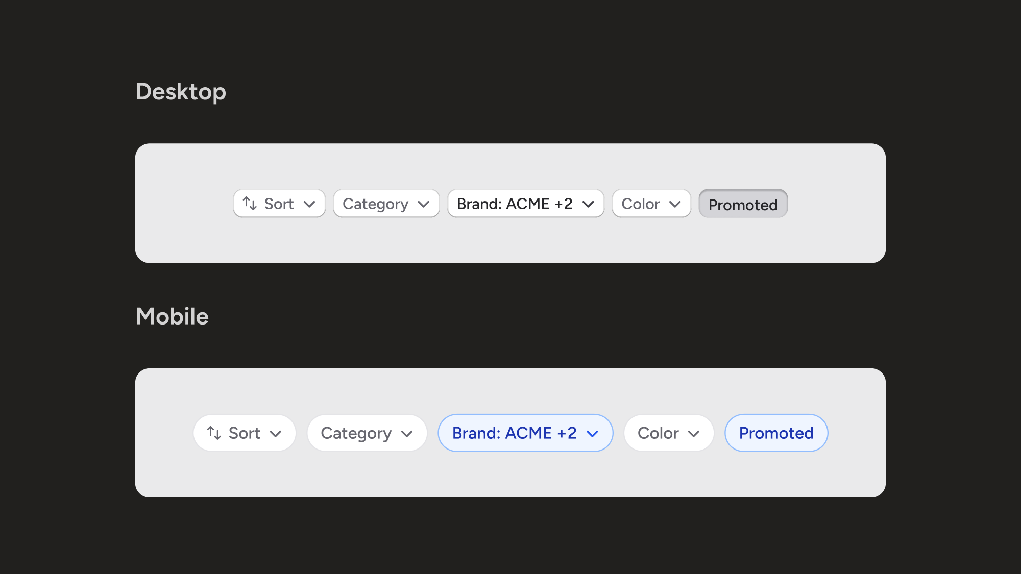
I did not try to force the same UI across handheld, desktop, and web. I wanted them to share the same design language and framework while staying appropriate to their context. That meant consistent semantics for color, type, spacing, status, and core behaviors, with different expressions depending on the platform or use case.
On handheld, I biased toward speed, touch ergonomics, and scan-heavy work: larger tap targets, simpler layouts, stronger hierarchy, and patterns that supported one-handed use. On desktop and web, I allowed for more density, clearer grouping, and better side-by-side comparison for administrative and operational work. Status meanings stayed consistent across surfaces, but the UI expression changed with the job being done.
Pragmatic adoption
I was building this in a lean environment alongside multiple initiatives, so adoption had to prove itself in the work already underway. I started where the system could immediately remove repeated decisions and reduce friction in delivery of other ongoing roadmap work.
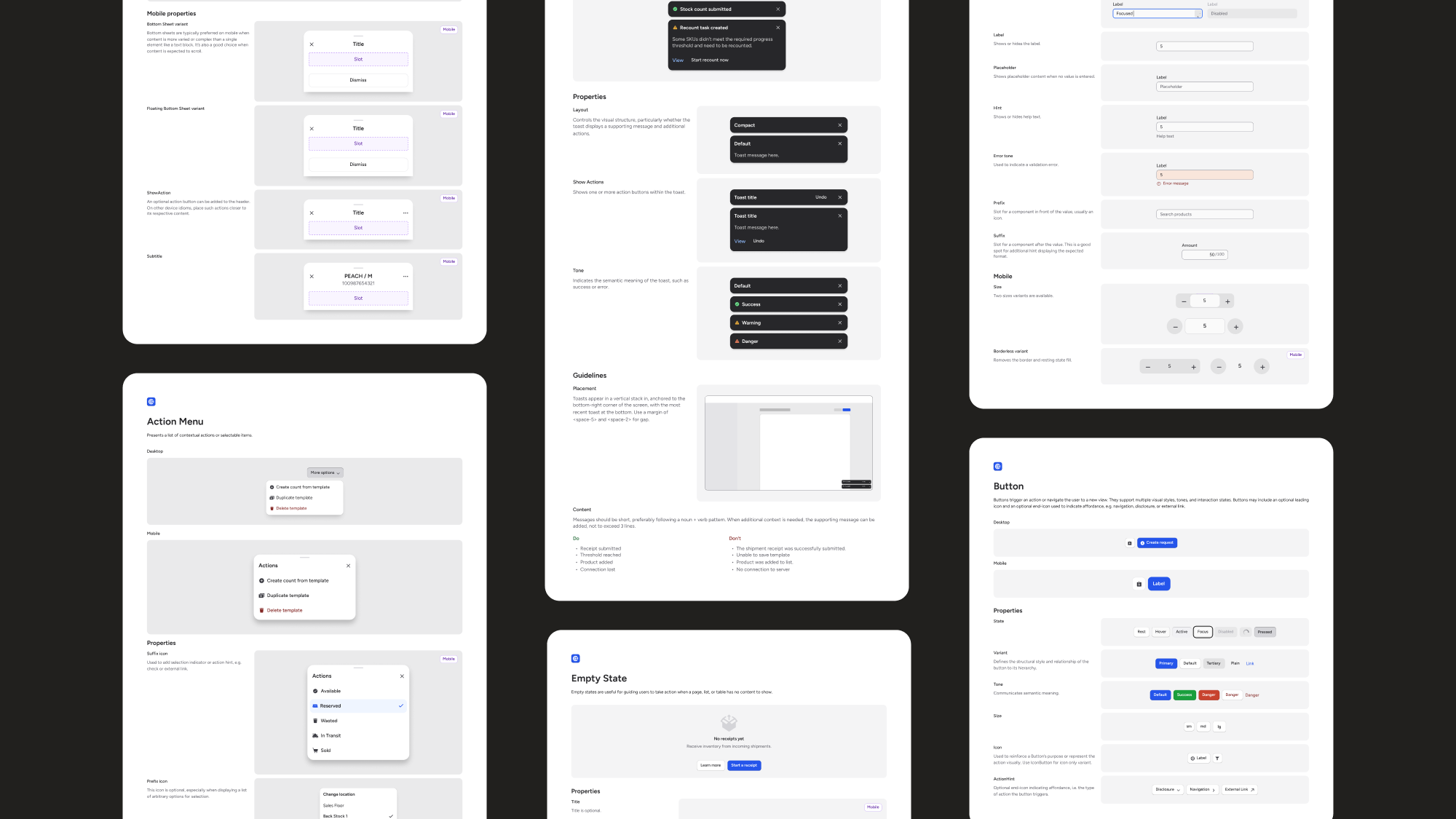
Organizational realities also influenced my decision to keep a fully centralized cross-platform component kit out of scope. Instead, I built a reference library in Figma with 30+ canonical components, tokenized foundations, naming conventions, and usage guidance, then paired that with implementation-ready outputs for web and MAUI. That gave teams a usable source of truth without over-centralizing too early.
Impact
The result was a shared foundation across three major product surfaces: a production-oriented token pipeline, 30+ canonical components, and a growing set of documented patterns and principles. That tightened the connection between design intent and shipped UI, reduced repeated design and engineering decisions on new work, and made the product suite feel more consistent and more modern.
Just as important, it made the product more structurally legible. The system moved important decisions out of tribal knowledge and into explicit semantics, reusable patterns, and machine-consumable outputs. That put us in a better position not only to ship faster now, but to take advantage of more agentic ways of working without compounding drift.
Reflection
If I were starting again, I would invest earlier in automated adoption tracking. Hardcoded-style checks, token coverage, and better reporting would have made it easier to see where the system was working and where drift was still happening.