Evolving an operational retail app for real-world use
Designing for speed, flexibility, and recovery in an environment where every second counts and interruption is the norm.
| Timeline | 2018–Present |
|---|---|
| My Role | Product design, Research, Front-end engineering |
| Area | Retail operations, Mobile workflows, Hardware interop |
| Tech | Figma, RFID, .NET MAUI |
Context
Over several years, I helped shape a handheld retail product used for fast-paced operational work in stores. This case study highlights some of the key design challenges and opportunities I encountered as the product evolved.
My role changed over time, from engineering into product design, but the thread stayed the same. I was helping move the product from a collection of workable flows toward something more coherent that held up better in real store use.
Challenge
Clarity is used in motion, on shared devices, under time pressure. Store associates often juggle inventory tasks, interruptions from the floor, and device issues at the same time. In that context, even small interaction costs add up quickly.
Many of the workflows looked straightforward on paper. Locate an item. Scan a shipment. Pick units. But in practice, store work is full of interruptions and edge cases: missing inventory, partial quantities, duplicate scans, unstable network, customer interactions, changing priorities. Associates don't have the time or attention to decode a complicated screen.
Where the product was breaking down
A useful turning point was a comprehensive heuristic review I conducted across the handheld product. I looked at the app less as a set of individual features and more as a system supporting key store tasks that could stop and start at any moment. That shift made it easier to see where users encpuntered friction, where the product’s structure got in the way of the work, and where the experience broke down under network or device issues.
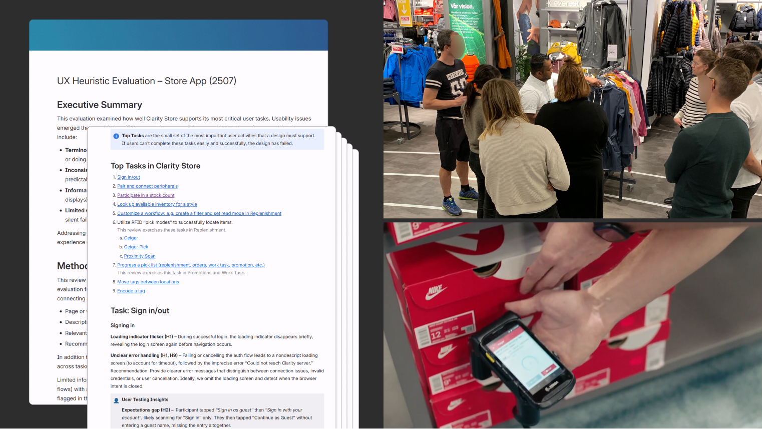
I reinforced that with workflow analysis and user observation work with a customer partner. Seeing how associates actually moved through store tasks made the gap clear between the workflow as structured in the product and the way work really unfolded on the floor.
A few recurring problems stood out.
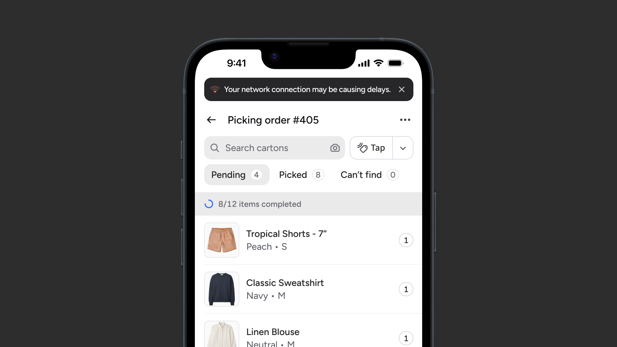
Store work is rarely linear, but the app often assumed users would move through one workflow at a time. Switching tasks meant losing momentum: backing out of deep page stacks, scrolling through long menus, and re-entering another flow from the top. That was cumbersome on its own, but the bigger problem was that users could lose their progress without a clean way to return.
Different parts of the product assumed different ways of working, with barcode often treated as the default even where RFID or direct item interaction would have been faster and more natural. That inconsistency fragmented the experience and limited the product’s ability to support richer item-level actions.
And when something did go wrong, users needed the app to help them recover immediately, not send them through a secondary, administrative flow.
These were less like isolated usability issues and more like symptoms of a product that had grown workflow by workflow without a strong, shared model for how each should behave or how users moved between them.
Approach
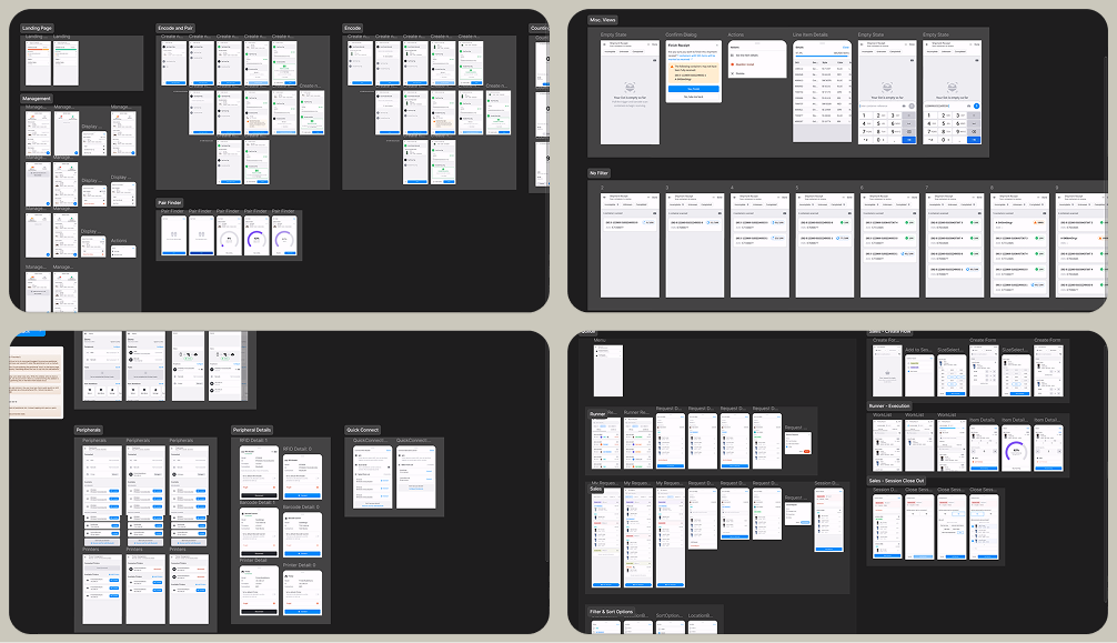
While there was continual work in enhancing individual flows, some of the more interesting work focused on fixing the structure underneath them.
One part of that was navigation. I helped move the product away from a cumbersome, list-heavy model toward a faster navigation framework that better supported interruption and task switching. That included a bottom tab bar for quicker movement between major contexts, a smarter quick-launch menu, and cleaner ways to move between active work without having to fully back out and start over. The goal was to reduce the penalty for changing direction in an environment where priorities could shift at any moment.
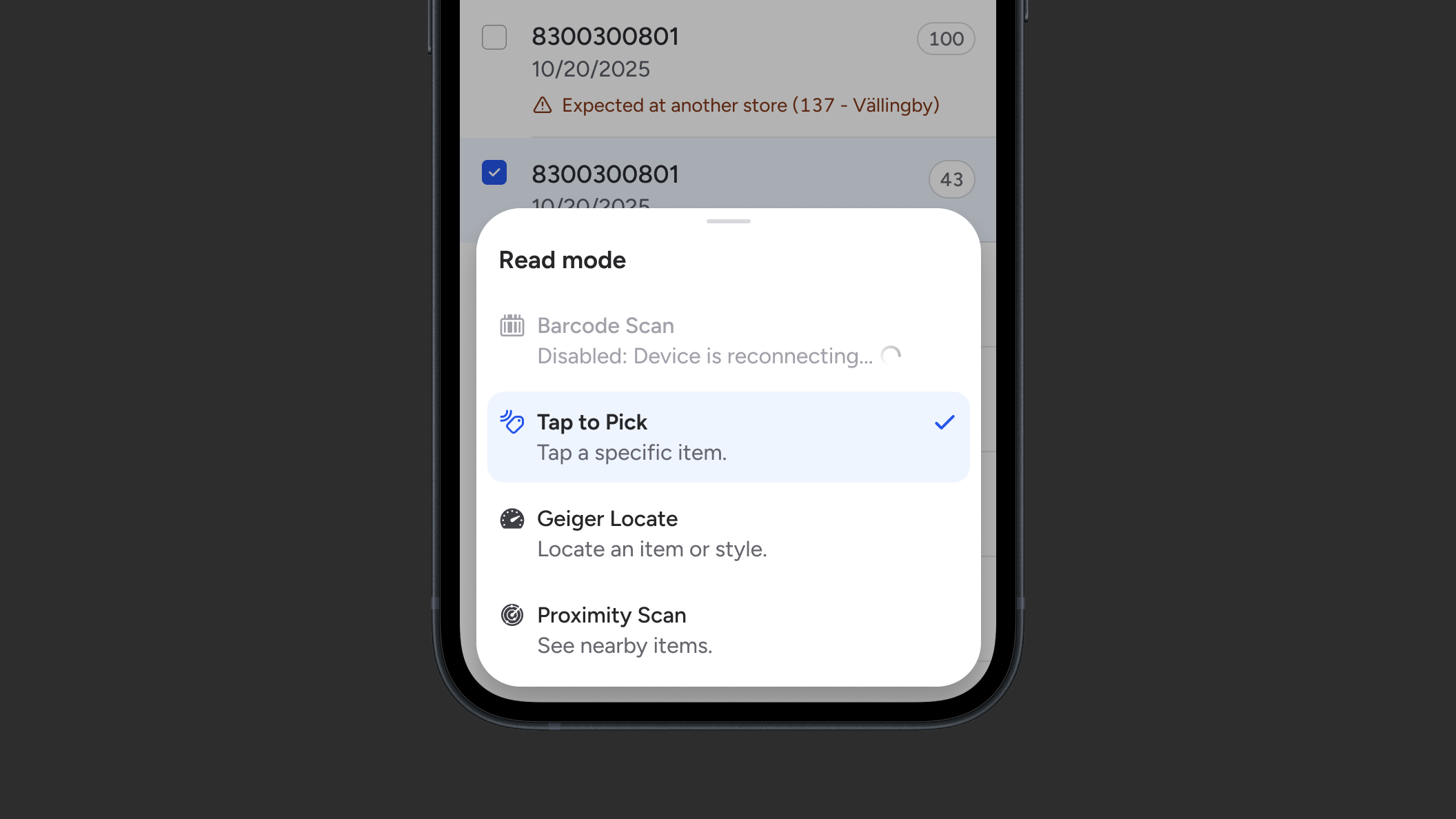
Another part was input. I pushed for a more consistent pattern around multi-modal interaction so the product could better support camera, barcode, and RFID without each feature inventing its own logic. This mattered not just for speed, but for flexibility. Once the product could treat scanning and tapping as more adaptable entry points, it opened the door to richer item-level workflows in places that had previously been more rigid.
That led to a broader shift in workflow entry. I introduced an "inverted" process where the user could start with the item and then get a list of relevant, deep-linked actions, rather than navigating through menus first and scanning second. This was a better fit for how work actually happened. Users were often responding to an item, a task, or a moment on the floor, not setting out to explore the product’s feature catalog.
I also spent time on error recovery. Peripheral issues were a recurring source of frustration, particularly around RFID device connectivity. We worked toward better error handling and more direct reconnection flows that helped users get back to work without losing progress or detouring into setup screens. That was an important shift in philosophy: when something goes wrong, recovery should still feel like part of the workflow.
Outcomes
Over time, the product became easier to use, more resilient, and less punishing when work was interrupted. Users had quicker paths into the task in front of them, more flexibility in how they got there, and better support when device issues broke the flow. Just as importantly, the product started to behave more consistently across workflows, which made later improvements easier to build without re-solving the same problems each time.
Reflection
What this work reinforced for me is how easy it is for a product to make sense in isolated contexts, but be awkward to use in the real world. Over time, teams solve problems one by one, and the result feels fragmented when those solutions do not add up to a coherent experience.
A key part of my role was simply noticing that drift early enough to do something about it — identifying where users were being asked to follow the product’s logic instead of staying focused on their own work and tightening patterns. While not flashy, I've come to realize that this kind of design work is especially high-leverage.